
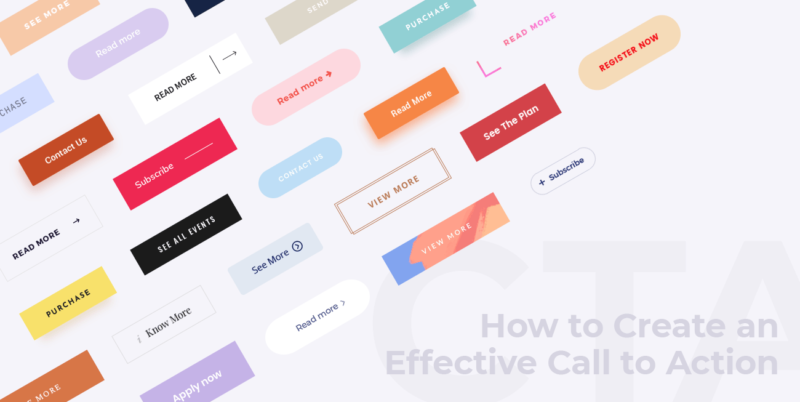
How to Make Your Call to Action 10x Stand Out
In order for a call to action to be effective, it must first stand out. This can be achieved in a number of ways, such as using an attention-grabbing headline. Once the call to action has been noticed, it is important that it is clear and concise; the viewer should know exactly what they are being asked to do.
Additionally, the call to action should be relevant to the rest of the article or website, otherwise, it will seem out of place and ineffective.
Your call to action is one of the most important elements on your website or landing page. It’s what tells your visitors what you want them to do next, and it needs to be clear, concise, and effective.
The building blocks of a strong CTA
Calls to action are an important part of any marketing campaign, but they can be tricky to get right. Here are a few things to keep in mind when crafting your own call to action:
1. Keep it simple and clear. Your call to action should be easy to understand and not require too much thought to parse. Use simple language and avoid ambiguity. If your offer is compelling enough, they’ll be more likely to take you up on it.
2. Make it specific and use strong verbs that convey a sense of urgency. Vague calls to action like “Learn more” or “Sign up now” are unlikely to lead to conversions. Be specific about what you want the reader to do, and why they should do it.
3. Use active voice. Passive voice construction (e.g., “Sign up today to receive our latest offers”) can make your call to action sound weak or confusing.
4. Make it easy for visitors to find your call to action. Use contrasting colors or make it larger than the surrounding text so it’s impossible to miss.
Make your CTA stand out with design
Your CTA, or call-to-action, is one of the most important elements on your website or landing page. It’s what tells your visitors what you want them to do next, and it needs to be clear and effective in order for them to take action. Design can play a big role in making your CTA stand out and be more effective. Here are some tips:
1. Use colors that contrast with the rest of your page. This will help your CTA stand out and be more noticeable.
2. Use a large font size for your CTA so it’s easy to read.
3. Make sure the CTA button is big and easily clickable.
4. Use an arrow or other visual cue to point to the CTA button so visitors know where to click.
Use Graphic Design
Graphic design is a powerful tool that can be used to attract audience attention. When used correctly, graphics can help to highlight the most important information and make it more visually appealing. Here are some tips on how to make your call to action stand out:
1. Use contrasting colors: A great way to make your call to action stand out is to use contrasting colors. For example, if your website or blog has a lot of white space, you could use a bright color for your call to action button or text. This will help it to stand out and grab attention.
2. Use an eye-catching font: Another way to make sure your call to action stands out is by using an eye-catching font. Choose a font that is bold and easy to read so that people will be able to see it and act on it quickly.
Call to action persuasive language

When you’re crafting a CTA, it’s important to use persuasive language that will motivate your audience to take the desired action. Here are some tips to make your call to action phrases stand out:
1. Use strong, active verbs that convey a sense of urgency, such as “sign up now,” “get started today,” or “download immediately.”
2. Make it clear what the benefit of taking action will be, such as “save 10% on your order” or ” receive a free e-book.”
3. Keep your CTA short and to the point- you don’t want to overwhelm or confuse your reader with too much information.
4. Use contrasting colors or font sizes to make your CTA stand out from the rest of your content.
Place your CTA in a strategic location
Simply having a CTA is not enough – it also needs to be placed in a strategic location for maximum impact.
There are a few factors to consider when determining the best location for your CTA. First, think about where your target audience is most likely to see it. If you’re running a print ad, for example, placing your CTA near the top of the page is more likely to grab attention than if it’s buried at the bottom.
Second, consider the context in which people will see your CTA. If they’re already engaged with your content, they’re more likely to take action than if they’re seeing it for the first time.
You don’t want it to be too close to the top or bottom of the page, as visitors may not scroll down far enough to see it. Instead, try placing it near the middle of the page, where it will be more visible.
You also want to make sure your CTA stands out from the rest of the page. Use a contrasting color or font size so that it catches people’s attention. You can also use images or buttons to make your CTA more eye-catching.
Test and iterate on your CTAs
Your call to action (CTA) is one of the most important elements on your landing page or website. It’s what tells your visitors what you want them to do next, and it can make or break your conversion rate.
That’s why it’s so important to test different versions of your CTA to see what works best. Try different copies, colors, and placements to see what gets the most clicks. And don’t be afraid to experiment – you never know what might work until you try it!
Once you’ve found a CTA that works well, keep testing and iterating on it to see if you can get even better results. Small changes can sometimes make a big difference, so it’s always worth testing to see if you can improve your conversion rate.
Conclusion

In order for a call to action to be effective, it must be noticeable. This can be achieved by making the call to action stand out in some way. One way to make a call to action stand out is to use a contrasting color. Another way to make a call to action stand out is to use a large font size. Finally, you can make a call to action stand out by making it bold or italicized.
When you are trying to get people to take action, whether it is to buy your product, sign up for your service, or read your blog post, you need to have a strong call to action. If your call to action is boring or buried at the bottom of the page, people are not going to take the time to do what you want them to do.
So, if you think this article is helpful, please share it with the world, I’d appreciate it. Please leave me a comment too, thank you for reading.


