Unlock the Secrets of Professional Level Graphic Design Layout
Creating professional-looking graphic designs can seem like a daunting task, especially when you are just starting out. But with the right tools and knowledge, anyone is capable of creating graphics that look like they were designed by a professional. In this article, we will explore the secrets of professional-level design layout so that you too can create stunning graphics for your own projects.
What is layout in graphic design?
The graphic design layout is an essential skill for any designer to master. It is the process of putting together text, images, shapes, colors, and other elements in a way that creates a visually appealing piece of art. As such, it can be used to create almost anything – from logos and flyers to websites and magazine covers.
A good layout not only looks good but also communicates information effectively. A well-laid-out design can help draw the eye to important points or direct someone through a story. Professional-level layout in graphic design requires an understanding of composition principles such as how to use space effectively, how different elements interact with each other, and how typography should be handled for maximum impact. By unlocking these secrets designers can produce stunning layouts that capture attention and convey messages clearly and accurately.
Understanding the Basics

The graphic design layout is an essential part of creating visually appealing images that communicate a message. Understanding the basics of graphic design will help you create effective, high-quality designs. Whether you’re just starting out with graphic design or looking to take your skills to the next level, learning about the fundamentals of good layouts will give you a great foundation for success.
The layout is all about arranging elements on a page in order to create balance and visual interest. This involves considering composition, color palette, typography, and space between elements. There are many theories and principles that can be applied when designing layouts – from grid systems to asymmetry – which can be used to guide your decisions as you develop your own style and aesthetic.
Pro Tips for Composition to Design Layout
Are you a graphic designer looking to level up your composition skills? The great composition can transform even the simplest design into something spectacular. Understanding what is layout in graphic design can help you create gorgeous visuals that will wow your clients and take your career to the next level. Here are some pro tips for boosting the composition chops that will have you creating stunning designs in no time.
From using negative space to establish visual balance to experimenting with scale, there are many ways to compose a winning page layout. An asymmetry is also an important tool in any designer’s arsenal; it adds interest and dynamism while still keeping things organized and aesthetically pleasing. By learning how to use dynamic elements like color, contrast, texture, and shape, you can craft a beautiful design that stands out from the rest.
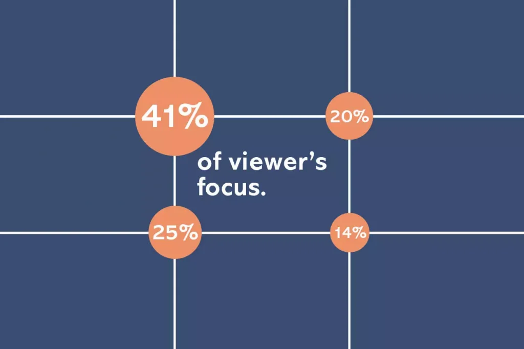
Negative Space
Negative space is an important concept layout in graphic design that often gets overlooked. It’s the empty or blank space within a design, which is just as important as the content itself by adding balance and defining elements within the composition. Professional graphic designers make use of negative space to create aesthetically pleasing designs and to make sure there’s enough breathing room around their graphics and text.
Visual Balance
Visual balance is a key element in all types of design, whether it be web or print based. It’s important to have a good understanding of the principles behind visual balance in order to create designs that are aesthetically pleasing and effective.
Visual balance is achieved by controlling how elements within a composition relate to each other and how they interact with one another. A balanced composition will appear symmetrical, with elements evenly spaced out. However, this doesn’t mean that compositions must be completely symmetrical for them to be considered balanced. Working with asymmetry can also produce visually balanced designs when done properly. Weight and size play an important role too; balancing heavier objects against lighter ones can help achieve harmony between different elements within the composition.
Asymmetry

Asymmetry is the idea that elements in a design should be arranged unevenly, instead of being perfectly balanced. Asymmetry adds visual tension to design layout, which can draw attention to certain areas and create an interesting look. Learning how to use asymmetry effectively can be challenging but with practice, you’ll soon be able to incorporate it into your designs with ease.
Contrast
One major factor in successful designs is contrast. Contrasting elements create visual interest and help guide the eye through a layout, resulting in greater impact and more visually appealing graphics.
Contrast comes in various forms – color, size, typeface, texture – each providing unique opportunities for designers to create bold visual statements that draw viewers into the work. To make the most of these options, designers must think outside the box and consider how they’ll use each element to inform their overall design choices.
By carefully crafting a balance between contrasting elements, a designer can bring life to an otherwise dull layout and elevate it to professional-level artwork.
Proportion and scale
Proportion and scale are integral parts of layout in graphic design. Knowing how to use them correctly is key to creating a successful visual product that resonates with viewers. By understanding the basics of proportion and scale, designers can create compositions that are balanced, aesthetically pleasing, and easy to navigate.
The proportional relationship between elements in a composition is essential for making sure all parts work together cohesively. Elements must also be scaled appropriately in order for the composition to appear visually pleasing, as well as allow it to fit within its predetermined space. When used together properly, proportion and scale can bring out the best qualities in any graphic design piece. They will help guide designers through the creation process so they can produce designs that are impactful and draw attention from those who see them.
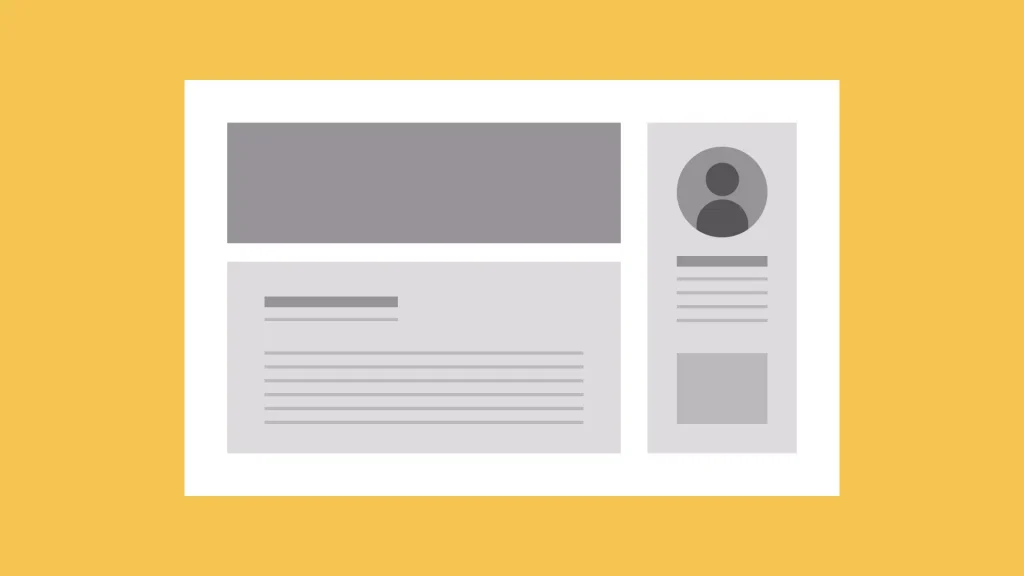
Grid Systems

Without grids, designers would be unable to create sophisticated and organized designs. So what exactly is a grid system? A grid system consists of columns and rows in which all the visual elements within an artwork are aligned and structured. Grids are used to create balance, unity, and hierarchy in a design.
Grids can be applied to almost any type of artwork including web pages, posters, brochures, and more! They also offer numerous benefits like organizing content clearly, creating a visually appealing composition that attracts attention to important elements to design layout, and making it easier for users to understand complex information quickly. Using grids can also help you save time by allowing you to easily rearrange elements without having to start from scratch every time. With these benefits in mind, it’s no wonder why professional designers use them!
Color Theory
Color theory plays an important role in graphic design layout. It is essential to understand how different hues, tints, and shades interact with one another in order to create a visually appealing composition. Color can evoke certain emotions and feelings, something that must be taken into consideration when selecting the palette for a design. Professional designers carefully consider the principles of color theory when making decisions about what colors to use in their projects.
The basic principles of the color theory include understanding the relationship between warm and cool colors, as well as complementary and analogous colors. Warm tones such as reds, oranges, and yellows are stimulating while cooler blues, greens, and purples tend to be calming or relaxing. Complementary colors are those which lie directly opposite each other on the color wheel whereas analogous colors sit side by side creating harmony within a design.
Text & Fonts

Text and Fonts can be one of the most daunting tasks for graphic designers to tackle. Deciding which font and size to use, how to incorporate text into a layout design, or even what type of text will best fit the overall concept can all seem overwhelming. However, with some understanding of the basics behind picking fonts and placing them correctly into your designs and what is layout in graphic design, you’ll be able to unlock the secrets of pro-level graphic design layout.
It all begins with understanding the different types of fonts available in various software programs and learning how to match them correctly for maximum impact. The location of your font should also be carefully considered – whether it is placed prominently as part of an image or hidden among other elements on a page – each has its own effect on viewers.
Texture and Repetition
The texture can be achieved through the deliberate integration of shapes, patterns, typography, and color. Repetition is also essential for creating a strong visual impact – it ties together all the individual elements to design layout to form a unified whole, whilst allowing for subtle variations that bring life and interest to the composition.
By carefully considering and manipulating these two elements, you can create eye-catching compositions that will take your designs to the next level. You may choose to layer multiple textures on top of each other or repeat an element throughout different sections of your work in order to achieve cohesion – whatever approach you decide upon, knowing how texture and repetition interact with one another will provide you with powerful tools for success in graphic design layout.
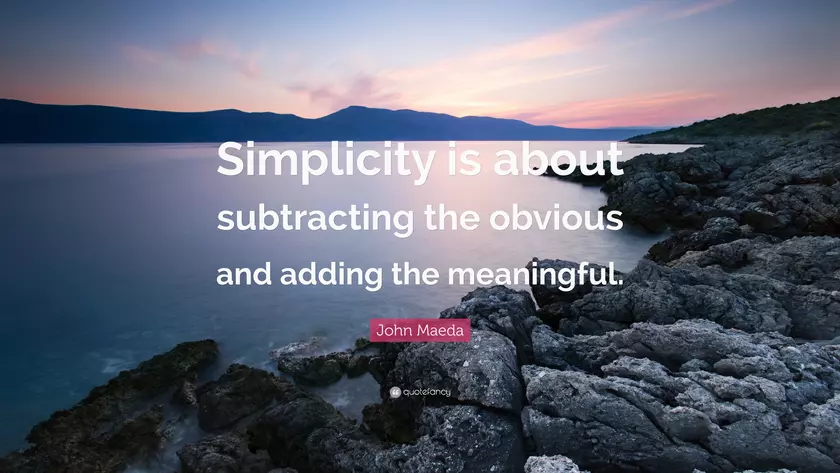
Meaningful Simplicity
Graphic design is a powerful tool that can be used to visually communicate ideas and messages. But for many, the technical aspects of graphic design can be intimidating and overwhelming.
Achieving meaningful simplicity in a layout requires careful consideration of the elements being included and how they interact with one another. Selecting only those elements which are necessary will ensure no unnecessary clutter or distractions which could detract from the overall message you’re trying to convey.
Achieving harmony between all the components in your design will help create an aesthetically pleasing visual experience for viewers without overwhelming them with too much information at once.
Creative Experimentation
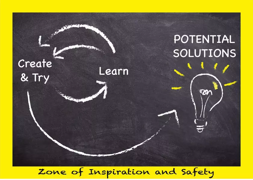
Creative experimentation helps designers create unique and visually stimulating compositions that stand out from the crowd. Whether you are a novice or an experienced designer, pushing your creative boundaries will help take your designs to the next level.
Using techniques such as white space, color, typography, and imagery in unexpected ways can be very effective in creating stunning layouts. Experimenting with different combinations of these elements allows designers to explore unlimited possibilities in their work while remaining rooted in established principles of design. With some practice, anyone can develop the skills needed to create eye-catching graphics that are sure to leave a lasting impression on any audience.
Conclusion

The success of a professional-level graphic design layout relies on a few key elements. By understanding what is layout in graphic design and how to use the principles of proportion and scale, color theory, texture, alignment, repetition, and contrast. The designer is able to create visually appealing designs that are both aesthetically pleasing and effective in conveying their message. With these techniques, designers can effectively create impressive layouts with fewer resources and less time spent.
By following these guidelines, designers can ensure they are creating professional-level graphic design layouts. The ability to successfully combine all of these elements will result in outstanding visuals that will appeal to any audience. Understanding the basics of visual communication will help professionals achieve aesthetically pleasing results while simultaneously communicating their message in an effective way.
Hope you found something valuable to design layout in this article if you like it, please don’t forget to share it with other audiences too. Much appreciate it. If you have something want to talk to me about layout, please leave me a comment below. Thank you for reading.


